Mobile optimised imagery
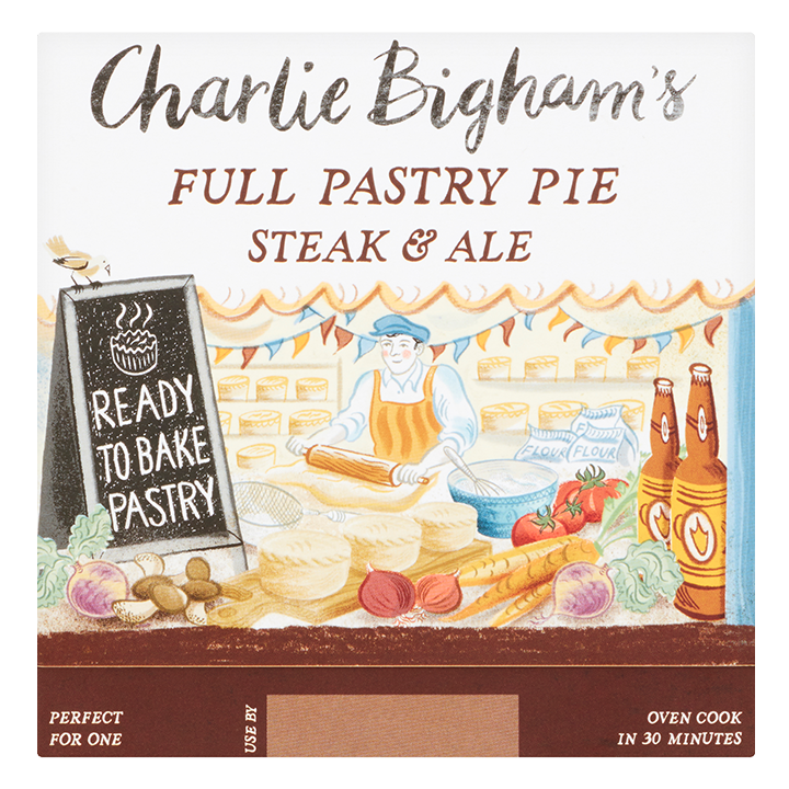
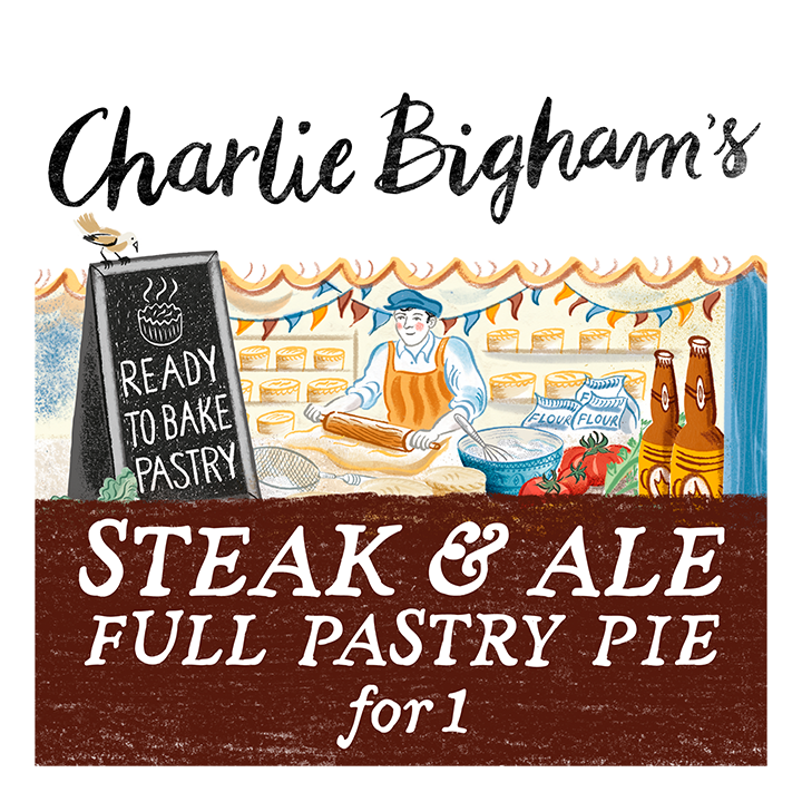
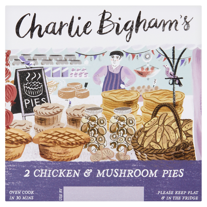
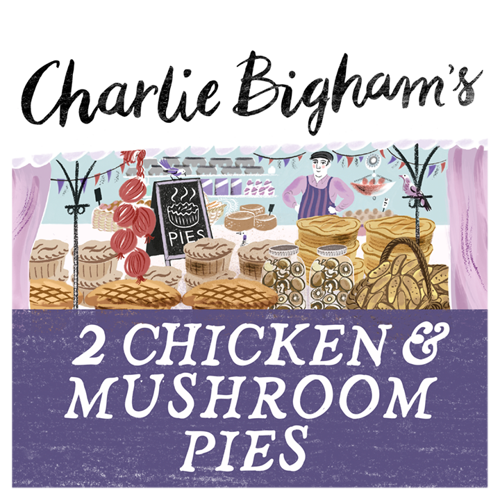
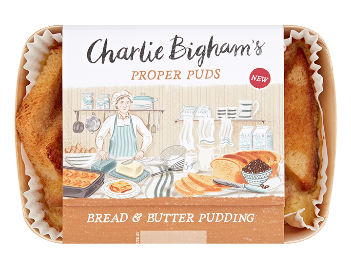
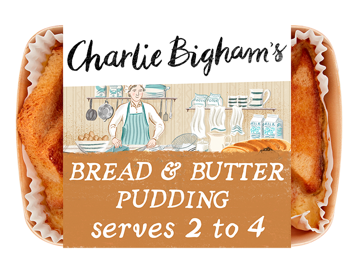
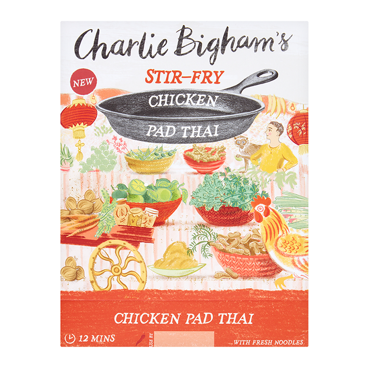
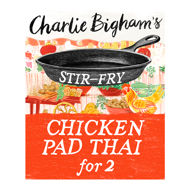
One such project we undertook for the brand Charlie Bigham’s involved over 50 products across various pack formats. Ensuring we highlighted the key call-outs whilst still maintaining brand integrity across the entire range played a major part in this process.
The team call on their extensive food packaging knowledge to remove and declutter unnecessary elements and emphasise the key call-outs, whilst always ensuring they maintain the integrity of the brand.
As you can see, the end result provides clarity on many levels. It is instantly easier to view, making clear purchasing decisions so much easier when shopping online on smaller screens. Without a shadow of a doubt, a mobile optimised hero image offers far greater legibility and makes the process of shopping online a whole lot less frustrating for the consumer.
This website uses cookies so that we can provide you with the best user experience possible. Cookie information is stored in your browser and performs functions such as recognising you when you return to our website and helping our team to understand which sections of the website you find most interesting and useful.
Strictly Necessary Cookie should be enabled at all times so that we can save your preferences for cookie settings.
If you disable this cookie, we will not be able to save your preferences. This means that every time you visit this website you will need to enable or disable cookies again.